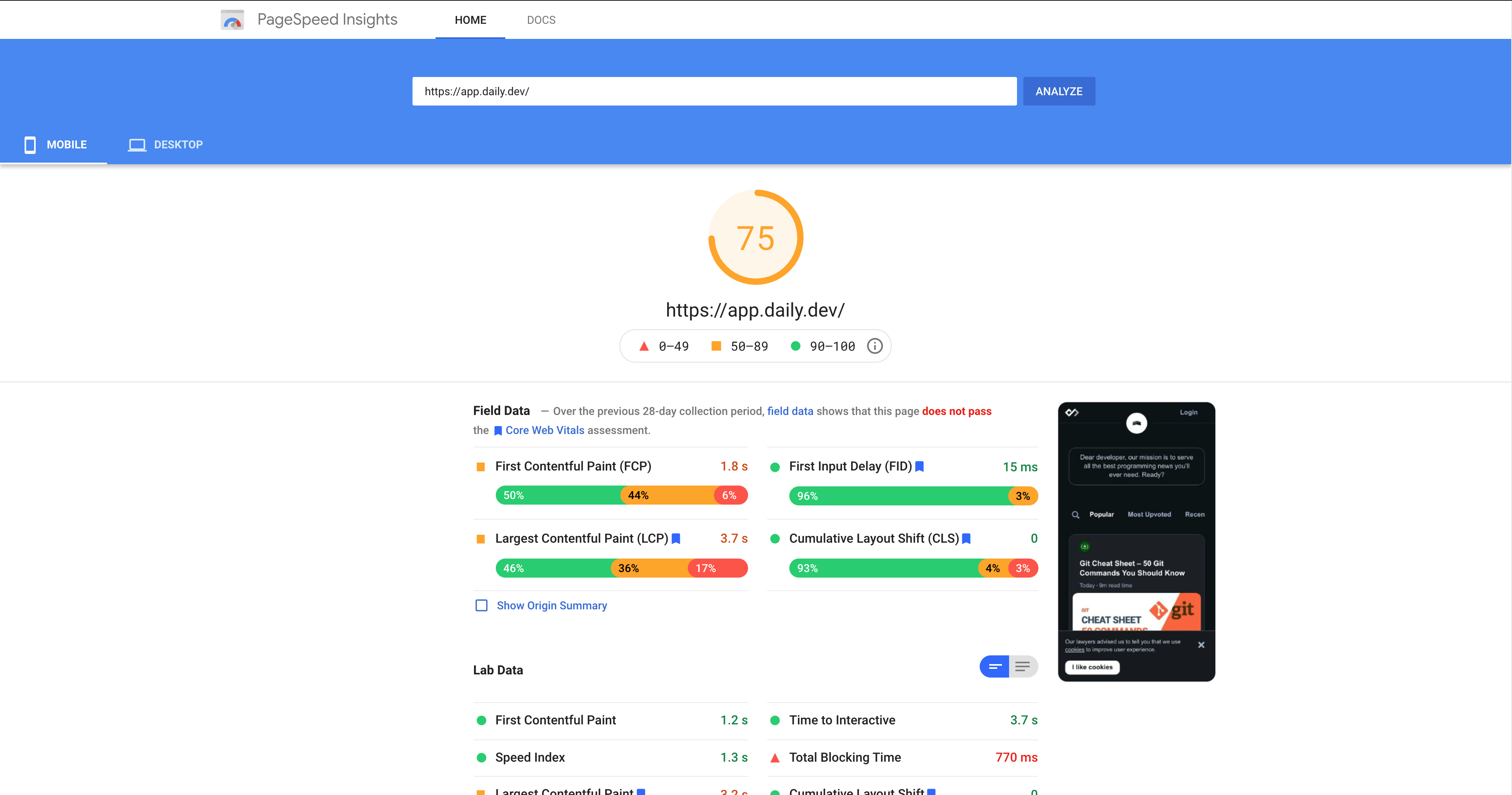
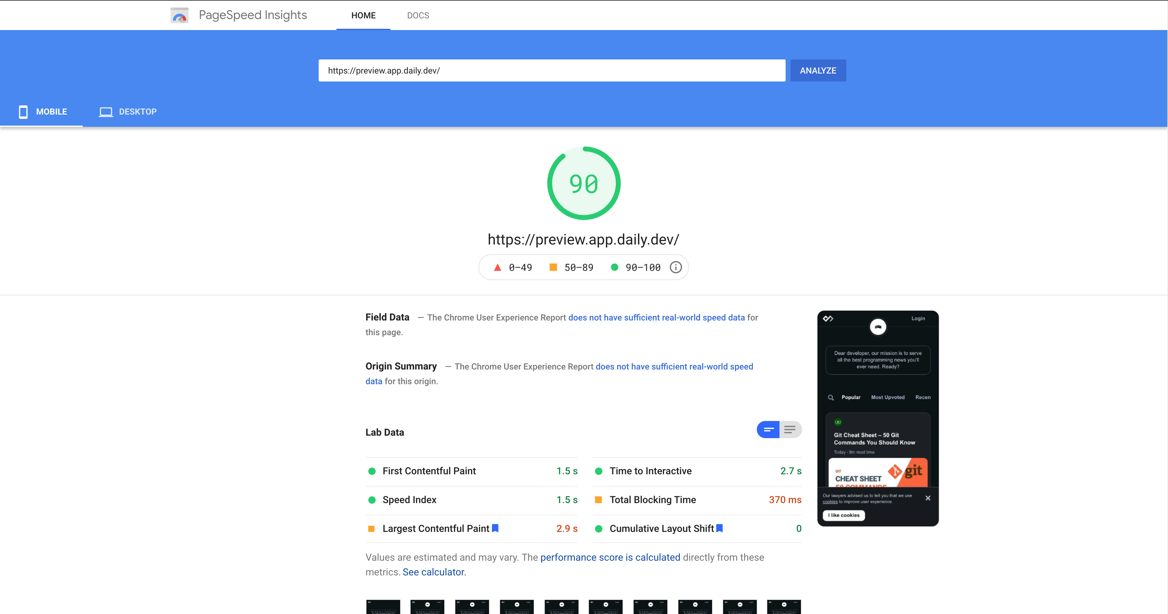
A few months ago, I started to build daily.dev's web application. I scaffold a Nextjs application and then considered two options for styling. styled-components and Tailwind CSS. The first follows the CSS-in-JS path, and the latter is a utility-first CSS framework. I decided to proceed with styled-components as I thought the flexibility of JavaScript would help me speed up my components' styling. I recently realized that I was wrong and started refactoring my existing and already in production application to Tailwind CSS. In this article, we will explore what I learned in the process.
styled-components
styled-components is an open-source JS library that uses the power of JavaScript to create styled React components easily. Its API is clean and so easy to use:
const Button = styled.button`
  color: grey;
  background-color: white;
`;
It utilizes tagged template literals to parse CSS code and turn it into a JavaScript object. The newly created Button element is a first-class citizen React component and can be used throughout the application and will keep its style.
The API is so convenient that other CSS-in-JS solutions have decided to follow the same pattern (e.g., Emotion), and it became almost the de-facto for standard.
Tailwind CSS
Tailwind CSS is an open-source utility-first CSS framework. Utility-first means that we combine a primitive set of CSS classes to create our desired style instead of semantic styling, where every component or HTML element gets a class name that then contains the style. Tailwind CSS also follows the Atomic CSS methodology. In Atomic CSS, every class sets only one styling rule. This way classes are reused more often, which results in a smaller bundle size (in most cases) and they also don't clash with each other. There are some exceptions where a Tailwind class can set multiple rules, but it's usually not the case.
Here's an example of how it looks like:
<div class="p-6 max-w-sm mx-auto bg-white rounded-xl shadow-md flex items-center space-x-4">
  <div class="flex-shrink-0">
    <img class="h-12 w-12" src="/img/logo.svg" alt="ChitChat Logo">
  </div>
  <div>
    <div class="text-xl font-medium text-black">ChitChat</div>
    <p class="text-gray-500">You have a new message!</p>
  </div>
</div>
The example is taken from the official documentation. You can see that there is no CSS code here, just classes all over. These classes are bundled with Tailwind CSS.
At its essence Tailwind CSS is a PostCSS plugin, but you can use it with SASS, less, or any other CSS processor you like.
Why I chose styled-components?
The number one reason for me to choose styled-components is its developer experience (DX). You can benefit from the maturity of the JavaScript eco-system for styling your components. No more losing your head and legs in too long CSS files and classes that you can't track how you use them and what will happen if you change them. With styled-components, your styles are just another variable. Thanks to styled-components API, you still use CSS and don't have to learn a new language or API. The only difference is that you write your CSS in your JS files or even JSX. Critical CSS extraction and bundle splitting also are a no-brainer.
For me, Tailwind CSS at the time looked too verbose. Like it would fill my HTML with long class names that will affect the readability of my code. Another thing is that I didn't want to learn Tailwind classes which felt like a new API or language to write my styles.
Eventually, the DX had the upper hand, and I started to roll out with styled-components.
What made me look back at Tailwind CSS?
Performance is an important factor in every web application. It's a coherent part of user experience and may affect conversion rate, retention, and other metrics. Using PageSpeed Insights and Lighthouse, I constantly measure the performance of my application. When I released the feed page to production, I measured its performance again and was shocked to see the score of 75 on mobile.

I usually follow the performance best practices such as dynamic import of JavaScript, optimize bundle sizes, lazy load images, etc. But the feed page is trickier because it contains a lot of HTML elements than an average web page. Then, I remember reading this article about the cost of CSS-in-JS. They mentioned that it's super easy to cause performance bottlenecks and that a lot of work is done in runtime. I started profiling my JavaScript code and indeed saw that a lot of time is spent on my styled button component, which is used throughout the application. I had two options, either try to optimize the existing component or create it from scratch using the good old CSS files and classes. I chose the latter because I prefer to move the workload to build time rather than runtime. To make it a little easier for me, I used Tailwind CSS as my go-to framework instead of truly starting from scratch. I installed Tailwind CSS from NPM, applied a few changes to Tailwind's config file to fit the design system, followed some production best practices, like using PurgeCSS to reduce the final bundle size, and hit the refactor road. I knew that refactoring the application in one shoot will take too much time, so I started with the feed page. I refactored every component that can be found on the feed page, from styled-components to Tailwind CSS. I used CSS Custom Properties instead of dynamic properties and used some awesome PostCSS plugins to do some heavy lifting. The result amazed me. Suddenly, the mobile page scores 90!

Many of you might think that I could achieve the same performance with styled-components with a little optimization. And it might be true, but to think that I have to constantly monitor how I write my styles which is a fundamental aspect of web development, is honestly frightening. Using dynamic properties is one of the performance bottlenecks in styled-components and other CSS-in-JS solutions, and it's so tempting to use it!
When it comes to styling, I realized that it's better to use the platform and stick to CSS. For my use case, I decided to combine Tailwind CSS with CSS modules to create a more flexible framework rather than using only utility classes. React supports CSS modules out-of-the-box and so does Nextjs so it's a piece of cake to make it work together.
The future of CSS-in-JS
Don't get me wrong, I'm not advocating against CSS-in-JS. I believe every developer should do their checks according to their use case. I also must admit and say that I'm not a Tailwind CSS fan. I think that learning a new utility classes-based framework is not the way to go for web development. CSS-in-JS DX is so great and we can also harness babel, webpack, and the rest of the JavaScript eco-system to our favor. But it must happen on build time. There are already some libraries on GitHub that are on the right track like Linaria and Compiled. But they do need to get some production mileage. But my bets are definitely on libraries like these. Build time CSS-in-JS is the future.
That's it! If you have any questions feel free to reach out on social media.